











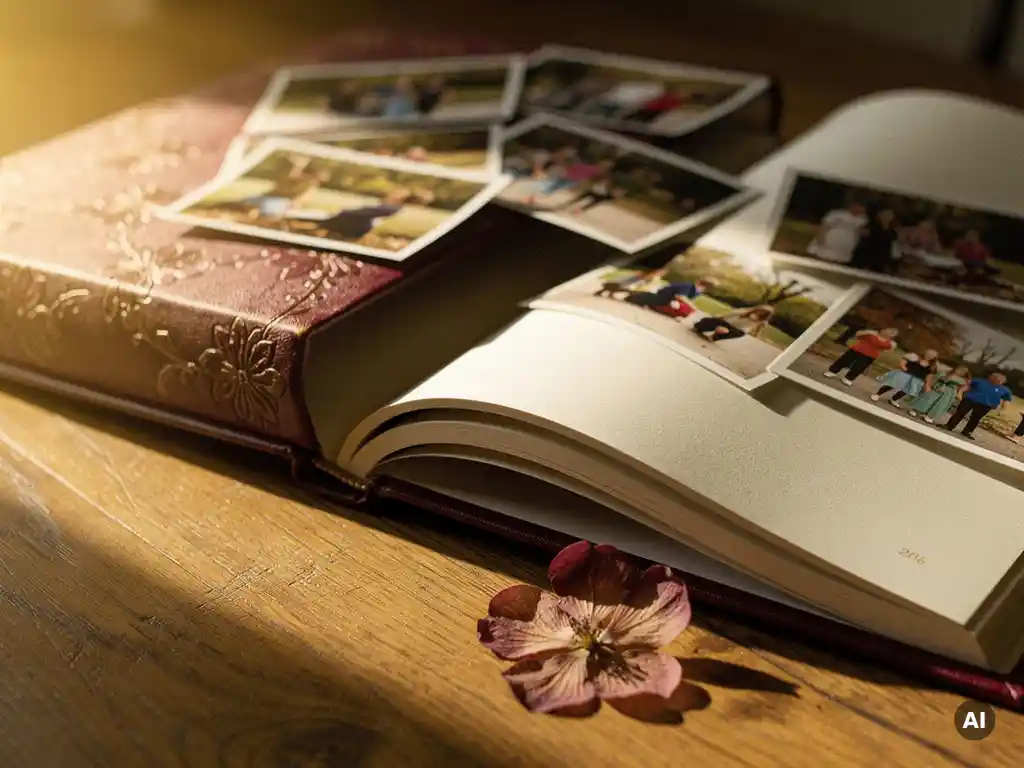
The best yearbook cover design combines a strong focal photo, a clear and readable font, and a visual style that reflects the mood of the memories inside. A great cover is the first thing people see, so it needs to feel both personal and polished. Below, we answer the most common questions about choosing a yearbook cover that truly does justice to the moments it represents.
What makes a yearbook cover design stand out?
A yearbook cover design stands out when it immediately communicates emotion and identity. The strongest covers share three qualities: a compelling hero image, a cohesive color palette, and typography that is easy to read at a glance. Together, these elements tell the viewer exactly what kind of memories they are about to relive.
Beyond the visual basics, the best covers feel intentional. A cover that looks like someone put real thought into it, even if it came together quickly, carries far more emotional weight than one that feels generic. Think about what the year, trip, or milestone actually felt like, and let that feeling guide your design choices. Warmth, adventure, nostalgia, celebration: each has its own visual language.
Contrast matters too. A cover with strong contrast between the background and the text is not only more striking, it is also more legible. Whether you go bold and graphic or soft and minimal, make sure nothing competes with the main image for attention.
What are the most popular yearbook cover styles?
The most popular yearbook cover styles fall into a few reliable categories: full-bleed photo covers, collage layouts, minimalist designs, and themed graphic covers. Each style suits a different type of memory collection and personal taste.
- Full-bleed photo covers use a single striking image that fills the entire cover. This style works beautifully for travel albums and milestone events where one photo captures everything.
- Collage covers arrange multiple photos in a grid or mosaic layout, giving a preview of the variety inside. These are popular for year-in-review books and family albums.
- Minimalist covers use a single image or simple graphic with clean white space and elegant typography. They feel modern and sophisticated.
- Themed graphic covers incorporate illustrated elements, seasonal motifs, or decorative borders that tie into the book’s overall story, such as a floral frame for a summer holiday book or a starry background for a New Year album.
There is no single best yearbook cover style. The right choice depends on the story you are telling and the audience who will receive it.
How do you pick the right cover photo for a yearbook?
Pick the cover photo that best represents the emotional heart of the collection. It should be technically sharp, well lit, and composed in a way that still works when cropped or scaled to fit the cover dimensions. A great cover photo draws the eye immediately and makes someone want to open the book.
When selecting from your library, look for images that have a clear subject, good natural light, and genuine emotion. Candid moments often outperform posed shots because they feel alive. If the book covers a whole year, choose a photo from a peak moment, a birthday, a holiday, a trip, rather than a random everyday snap.
Also consider how the photo will interact with text. If you plan to add a title or date on the cover, choose an image with some visual breathing room, an area of sky, water, or soft background where text can sit cleanly without getting lost in detail.
Should your yearbook cover match the theme inside?
Yes, your yearbook cover should reflect the visual theme used throughout the book. Consistency between the cover and the interior creates a cohesive, professional feel and sets the reader’s expectations correctly before they turn a single page.
This does not mean every page needs to be identical. It means the cover color palette, font style, and overall mood should feel like they belong to the same family as the interior layouts. If the inside pages use warm tones and a relaxed layout, a cold, high-contrast cover will feel jarring and disconnected.
Think of the cover as a promise to the reader. It signals the tone of what follows. A whimsical, playful cover sets up a fun, casual book. A clean, elegant cover prepares the reader for something more refined. Matching the two makes the whole experience feel intentional and complete.
What text and fonts work best on a yearbook cover?
The best fonts for a yearbook cover are clean, legible, and emotionally appropriate to the subject. Serif fonts feel classic and timeless, making them ideal for formal milestones. Sans-serif fonts read as modern and clean. Script or handwritten fonts add warmth and personality but should be used sparingly and only in larger sizes where they remain easy to read.
Keep the text on your cover minimal. A title, a year, and perhaps a subtitle or name are usually enough. Overcrowding the cover with text competes with the photo and makes the design feel cluttered. Let the image do most of the storytelling.
Contrast is critical. Light text on a dark background or dark text on a light area of the photo ensures readability. Avoid placing text over busy, detailed parts of the image. If the photo makes it difficult to place text cleanly, a semi-transparent overlay behind the text can solve the problem without hiding the image entirely.
How does AI help you design a yearbook cover effortlessly?
AI helps you design a yearbook cover by automating the most time-consuming decisions: selecting the best photo, assessing image quality, and arranging the layout so it looks considered and polished. Instead of starting from a blank page, you start from a curated result that is already close to finished.
Modern AI photo book platforms analyze your entire photo library, score images for sharpness, lighting, and composition, remove duplicates, and surface the strongest candidates for your cover. This means the photo most likely to make a great cover is identified for you, rather than requiring you to scroll through hundreds of shots yourself.
The result is a cover that looks like you invested significant time and care, even if the whole process took under a minute. For busy people who want a beautiful, tangible keepsake without the design work, AI-powered tools close the gap between intention and execution.
How PastBook helps you create the perfect yearbook cover
We built PastBook to take the effort out of creating beautiful photo books, starting with the cover. Here is what we handle for you:
- Selezione automatica delle foto: Our AI analyzes your photos for quality, composition, and context, surfacing the best candidates for your cover without manual sorting.
- Rimozione duplicati: Similar and low-quality images are filtered out so only your strongest shots make it into the final design.
- Layout istantaneo: In under 60 seconds, your photos are arranged into a print-ready book with a cohesive cover and interior design.
- Formati flessibili: Choose from soft cover, hardcover, or premium hardcover in A4 or A5, printed on FSC-certified premium paper and shipped worldwide.
- Importa da ovunque: Pull photos from your phone, Google Drive, Dropbox, Facebook, or Instagram, all in one place.
Whether you are preserving a year of family memories, a favorite holiday, or a milestone worth celebrating, we make it effortless to go from scattered photos to a stunning printed keepsake. Start your yearbook today at PastBook.com and have a print-ready design ready in minutes.